

What is this thing ❓
Notion-components is a React Component Library for the minimalists.
Build your web app with a design system already in place. Highly inspired by Notion - The all-in-one workplace
One Simple button is already released on npm too! Here, check it out!
It's this Minimalistic approach of design of these components, that make them fit for every type of app. I think for a component library, every micro-interactions or behavior counts and I have built its first component by keeping everything in mind.

How did it all start? 🌟
When I first started building projects with React (Just after learning the basics of it) I Immediately jumped into using Material-UI for my first Project. The experience of using it and how easy it was for React beginners to pick it up was just Awesome!
But one thing kept bugging me. It was the fact that the whole Library was built on React, Javascript, and Typescript. The exact things that I was learning! 🤯
Setting up the project 🏗️
A quick google and I found out about this thing called create-react-library. Honestly, one of the easiest ways for setting up a project like this!
On top of that, its Easy-to-use CLI sets up two projects for us :
- The first one is for actually building components. This is where all the code, related to your
shinycomponents will go. - The second one is just a
create-react-appproject, which gives us a way of testing the library in production while we build it!
It also takes care of all the scripts that are required for building the project files into the dist folder and publishing the library to npm!
Although I do think its docs are not detailed and easy enough to read for beginners,
but in the end, everything works!
Hiccups along the way 😑
Damn you! React unmount

When I started building this, I made a promise to myself that I WILL NOT use an external animation library for this one. Everything PURE CSS.
But then this happened
const Button = ({ show = true }) => (
  show
  ? <Dropdown style={{ animation: `fadeIn 1s` }}>HELLO</Dropdown>
  : null
)
This way the mounting of dropdown was animated, but there is no way to animate the unmounting because we remove the <Dropdown/> from the DOM as soon as the show prop changes to false!
onAnimationEnd came to the rescue! It enables us to "schedule" an unmount. So when the fadeOut animation ends, the show turns to false.
I fixed this with the help of this great blog!
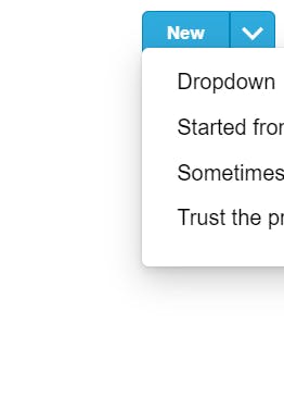
Dropdown positioning!
Let's say, you import the Buttonwith a dropdown and place it in the corner/edge of the viewport. Well Obviously the Button works but then this happened
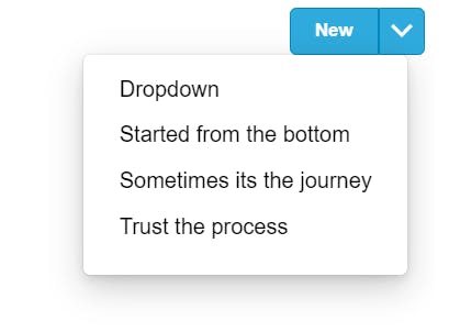
For a temporary fix, I created two props :
top- Controls the top CSS property for the Dropdownleft- Controls the left CSS property for the Dropdown
Now changing the values of these props gives us :
I know this not REALLY a fix, so I am looking for HELP here!
Storytime! Implementing Storybook 📚
Here npx sb init did most of the job, but I do think storybook docs were kinda confusing. Most of the time I found myself referring to This one
Deploying with Vercel 🚀
This was probably the easiest thing I have ever done. Just followed this and after some clicks, the production version of the storybook was up and running!
Check it out Here
Future Roadmap 🗺️
I am looking for more suggestions here!
- Invisible text fields Component (Just like in notion)
- Draggable List Component
If You are new to open-source development this project might be the perfect start! Check out its repo
Credits and relevant Links 🔗
ashwin.creates | He designed the logo and cover image for this project. Can't thank him enough!
- Github Repo
- npm
- notion.so
This a submission for Hashnode Hackathon Powered by Vercel